First of all, it’s important to understand what makes something charismatic. I used to think that charisma and popularity were the same, and that people either naturally had charisma, or they didn’t. NOT TRUE! Charisma is actually a blend of all the best traits that we instinctively find attractive, like honesty, integrity, positivity, and confidence. Charisma is something that can be learned and practiced.
Being charismatic doesn’t mean being loud or flashy; it’s about having an authentic connection with people that makes them feel valued and respected.
Charisma is a unique balance of credibility and human connection. By combining these qualities in your website, you can create an inviting environment that will make visitors feel welcome while still providing a sense of trust and reliability.
make your website more credible
Tweak #1: Use Modern Design Techniques
One sure-fire way to destroy your website’s credibility if it looks like it was designed in 2010! Make sure your website includes plenty of white space, updated photos and/or graphics, and maybe a few subtle animations.
There are some tried and true frameworks and techniques that you can use to layout your website content. But that doesn’t mean that it needs to look exactly like every other website out there. Use your own unique style and vibe. Try experimenting with depth by overlapping elements or adding subtle shadows. Add graphical accents or color overlays to photos. Try changing the angle or shape of your section borders.
It can be tempting to try using all these fun things at once but be sure to use moderation when adding accents and extras!
PRO TIP: Following the basic rules of design will help your website look cohesive and consistent. Remember also to keep your website consistent with your brand guidelines. Consistency and clarity are of utmost importance in a credible, modern website design.
Tweak #2: Test Functionality
Even if your website looks amazing, your viewers will get frustrated and confused if it doesn’t work correctly. Test everything! Make sure all your links are working, forms are set up properly, loading times are fast, and everything is working as expected. It’s a great idea to have someone else test out your website to make sure the flow is clear and that nothing is broken.
Don’t forget to test everything again on mobile devices. It’s best to test on a phone and a tablet. Different phone and tablet models may display your content differently.
PRO TIP: One way to quickly check what your content will look like on different devices is to use the “Developer Tools” in your browser. You can choose a device and your browser will show you what your content will likely look like on that device.
Tweak #3: Include Social Proof
Social proof is one of the fastest ways to show prospective customers that you know what you’re doing or that your product provides results. Product reviews and testimonials are probably the most common forms of social proof.
In addition to formal testimonials, you can include screenshots of positive comments on social media about your product or service, lists of companies you’ve served, awards you’ve received, places you’ve had articles published, or podcasts you’ve been featured on.
PRO TIP: Find fun and interesting ways to display testimonials. Highlight relevant sections with bold text or a pull quote to make them more scannable.
create connection with your website
Tweak #4: Write Customer-Focused Copy
Imagine you are the owner of a physical shop. What would a potential customer expect to find when they walk in the door? How would they want to feel? What would they want to learn?
Your website copy can quickly paint a picture for your visitor. At the top of your page, clearly let them know exactly what the page is about and how it will help them. Then, empathize with your visitors and help them find the solutions they’re looking for. You might also add some words of encouragement or humor so visitors feel welcome when they visit your website.
Avoid excessively using “I” or “we”, or talking about all the features of your product. Position yourself as a helpful guide in their desired transformation. Focus on the benefits your customers will enjoy when using your product or service, and how it will improve their overall quality of life.
PRO TIP: Scroll down your page reading only the headlines. Does your page still make sense? If not, edit your headlines to make sure they are more clear and compelling. Many people only scan through a web page – make it easy for them to understand your content quickly.
Tweak #5: Use Quality Photos & Videos
Using photos of people is a great way to create connection. If your website is for a personal brand, you’ll want to include photos of yourself. If yours is a product-based website, try including photos of people using your products.
Your photography can make or break your website! Use good high-quality photos with similar lighting and colors for consistency. You may want to hire a professional photographer for your website photos. Keep your color brand colors in mind when taking your photos for a more cohesive look.
Videos not only educate your visitors, but also create connections. If appropriate, use videos to explain or teach certain topics. Your visitor may connect with your personality or teaching style. Videos can also add additional credibility to your site.
PRO TIP: Use sincere smiles and open postures to create a feeling of warmth and caring with your photography.
Tweak #6: Create Emotion with Colors and Fonts
What feeling do you want your website to evoke? If you don’t have your colors and fonts for your brand chosen yet, thoughtfully select the styles for your brand and website.
Certain color combinations can quickly create different emotions for your viewers. Blues tend to be more calming, while bright red might seem more exciting. Your font and color combinations can make your website look more playful, more formal, or more luxurious.
Select your brand styles according to the product, service, or experience you want your viewers to have.
PRO TIP: If you don’t have one, create a style guide to refer back to as you create or audit your website. Include your HEX or RGB color numbers and your fonts. Keep your color and font selection simple! Reserve one bright color especially for your CTA buttons.
Time for action!
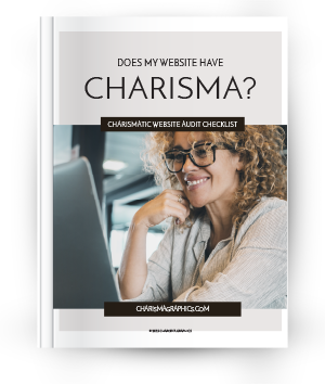
Want a free checklist? (Who doesn’t, right?!) I love the sense of accomplishment of checking things off of a list. Download our free Website Charisma Checklist and quickly find where your website shines and where you can improve your viewer experience and increase conversions.
Help, my website needs updates!
Need to improve your website’s charisma but not sure how to do it on your own?
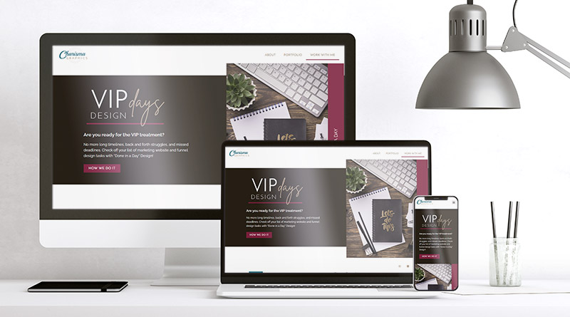
Save yourself the trouble and book one of our VIP Design Days to have your website updated for you!
Or schedule a free discovery call where we can talk about your website goals. I’d love to help you create your dream website.